Tuesday, 22 January 2013

Contextual Studies: 1850 - 1960 Industrialisation, World Wars and Post War Design

INDUSTRIALISATION AND THE BEGINNINGS
OF MODERNISM

Industrialism was highly influenced by the Industrial Revolution. Including mass mechanical production. Inventions like the steam engine and piston engine allowed for things to be produced quicker in mass.

The industrial revolution wasn't all positives, there were some negatives. The industrialism created a state of "Slave Labour".

Photo of Victorian City - Louis Jaques Daguerre


Railways

Cathedrals of the 19th Century became Victorian Railway Stations. "Fast Travel in a Machine on Wheels".

Rain, Steam and Speed - Turner


World Fairs

The World Fairs were the festivals of High machine Capitalism. Countries would come and "show off" their achievements and technological advancements. This would be a chance for the more successful countries to feel more "empowered" than the other countries who were perhaps less industrialised.

The Great Exhibition - 1851


This level of mass production caused the Arts & Crafts to rebel. Long gone were the days where hand crafted items were the only way of production, also gone was the level of personality and effort into production. Items on a conveyor belt are very impersonal and almost "Clone" like. The Arts & Crafts trade took this as an opportunity to sell items that were incredibly hand made with great quality. Although, because of this the only people able to afford these high quality items were the Bourgeoisie (middle - high class).


William Morris Wallpaper Design


The Paris World Fair, the focal point of which was the Eiffel Tower. This represented the 'wondrous' future of wealth and industrialism ahead. The Eiffel Tower became an idol, possibly the sin of people worshipping technology and industrialism instead of Gods.


"Fin De Siecle"
End of The Century

"Belle Epoque"
The Beautiful Era

"Gay Nineties"
Merriment and Frivolity


Henri Toulouse-Lautrec - Moulin Rouge 1891

Leonetto Cappiello - Absinthe Ducros 1901

A significant example of the New Era was the Athens Olympics in 1896.


Deptford 1890. This was the first ever Electrical Power Station.

During this Era Samuel Morse invented the Morse Code
Not long after the Telephone was invented by Alexander Graham Bell.

Another huge technological advancement in this Era was the Television.


ART NOUVEAU

Art Nouveau or Jugenstil was a luxury style that was very popular from 1890 - 1910. This style was concerned with Architecture, Design, Product and Interior Design. A good example of this style that is still around is the Paris Subway Entrance.


An example of some of the arts and crafts that were a part of this movement were the Jewellery by René Lalique.


THE ROOTS OF MODERNISM

The idea of modernity involved a belief in the notion of Historical Progress. In order to make the world modern, they had to create the world all over again. It is hugely situated around "Functional Design".

Deauscher Werkbund (Founded in 1907) wanted to integrate traditional crafts with industrial mass production.


Fritz Helmut Ehmcke - Cigar Box 1914

This was the first ever logo and corporate branding design.


AEG was the first company to employ a designer to create a corporate identity not just for the company, but for its products.


POST WWI (1915 - 1945)

During the first world war, the young and brave soldiers were sent to their deaths by the old. This betrayal led to the slaughter of hundreds of thousands of soldiers all in the name of war.

Most men who survived the war came home to horrendous conditions and would die from a massive Flu epidemic. Many people believe the second world war was caused by the Treaty of Versailles. Germany was then on its knees, and in the early 1930's the german people began to follow a racist and right wing path, later known as the Nazis.

Diagram of right and left wing.

Right Wing:

"law of the jungle" only the successful survive.
Extreme forms of Right Wing are: Racists, Elitists, KKK, BNP, White supremacists.
Capitalism.

Left Wing:

Sharing of resources.
Socialism.
Extreme forms of Left Wing are: Communism, The state rules over everything.


DADA

Dadaism was Anti Art, a reflection of corrupt culture. It was a highly influential form of Art and was a form of Protest.

It is one of the earliest forms of 'Shock Art'.

DE STIJL


De Stijl was a Dutch art movement which sought to create harmony and order through abstract art. Using mostly vertical and horizontal lines paired with primary colours. This movement became very popular.


BAUHAUS

Bauhaus Manifesto

Founded by Walter Gropius, who wanted to create a school where industrial methods were used. This school was responsible for some of the most prestigious artists and designers to date.


FUTURISM

Futurism was an artistic movement that originated in Italy. It emphasised and portrayed speed, power, technology and violence. 

Le Corbusier - Modern City

The problem with Le Corbusier's idea of a modern city is that it is too efficient, if this city was to be built, there is no where for people to communicate. It would be a constantly busy society.


THE IRON CURTAIN

The iron curtain. This was the joining of multiple countries to create the USSR which would prevent invasion from the west.

This was a part of the COLD WAR.

M.A.D (Mutually, assured, destruction)

POP ART

Americanisation became huge in the UK. It was the emergence of Youth Culture and highlighted Consumerism, influence of american culture, social/ class mobility and the importance of the media.

Andy Warhol


PUNK


Colour Theory: Colour

COLOUR


Hue - Pure Colour.

Tints - Pure colour with white.

Shades - Pure colour with black.

Above is a colour wheel, this shows colours and their opposites.

Goethe's colour wheel


This is one of the earliest representations of a colour wheel made with watercolours. This colour wheel was created by Goethe. He used his understanding of the light and dark spectra. Goethe also experimented with colour psychology and how they effect individuals. He then used his findings to associate colours with emotion.

Red - Hostile, Anger, Hot
Green - Calming, Peaceful
Blue - Deep, Cold
Yellow - Intellect, Joy
Orange - Brightness, Warmth
Purple - Royalty, Luxury
Black - Dark, Energy
White - Light, Absence, Success


The way we see colour can be affected by the colours accompanying. For example, a Black to white gradient with a solid grey bar across will give the effect that the solid grey bar also has a gradient. This is our eyes and brain getting confused trying to figure out the image. This is called an Optical Illusion.


OPTICAL ILLUSIONS

Optical illusions are images that cause us, the viewer, to perceive an image differently to what is actually correct. There are three types of optical illusions; the first is Literal Optical Illusions, these create images that are different to the ones that make them. The second, is Illusions that affect the eyes and perception. Thirdly, there is Cognitive Illusions, which "play tricks" with the unconscious parts of the mind.

For example, The two lettered squares are identical in colour. However because of the surrounding squares they appear to be different colours. This is proven with the image below the Illusion:


IMAGE ANALYSIS PRESENTATION


Image analysis presentation is how we 'read' or 'interpret' images.

We communicate in a number of ways such as:

Humour and Wit
Shock, Danger and Disgust
Sex
Education
Aesthetics and Beauty
Nostalgia, Sympathy and Empathy

Munch - The Scream
This is an extremely distressing image. The contrasting colours of the red sky and blue sea create and almost visual 'noise' that almost puts the viewer in the place of the subject. The pillars in the background look like figure, and still could be figures (I think it could be an optical illusion to make the viewer think).

Leonardo Da Vinci - The Last Supper

This piece is extremely accurate and has been painstakingly painted to follow a strict grid system. This creates an almost real effect that makes the room appear to carry on, making the viewer feel as if they are a part of the painting. This piece is a 'Fresco' which means it has been painted straight onto a wall.

Magritte - This is not a Pipe

Magritte created this piece to challenge the minds of the viewers. The joke is, that this is not a pipe, it is paint on a canvas.

Otto Dix - Card Players

This piece was part of the Dada movement and shows the horrors and disgusting acts war had upon humanity. The painting shows some disfigured soldiers that are still wearing their medals and uniforms. This was an obvious mock of Patriotism.

Marcel Duchamp - L.H.O.O.Q

This piece by Marcel Duchamp mocks western civilisation and the way they place idols on ridiculous pedestals.

Tracey Emin - My Bed

This piece reflects art in the sense that, each artist will always show a part of themselves in a painting. This piece offers a very abrupt look into the artists life.


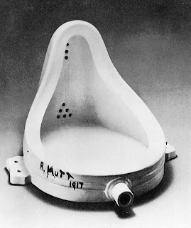
Marcel Duchamp - Fountain 1917

I found it extremely hard to interpret this piece And there was not a lot of what I felt, accurate, information so I had to compare most of my information to other resources. The fountain is part of the Dadaist movement and is something called a "Readymade". Many interpret this piece differently. Some believe that it is a metaphorical representation of Dadaism, in the way that a lot of people thought, at the time, dadaism was 'waste'. Others think it represents an Erotic value with the curvature of the piece. Some even believe it portrays characteristics of a sitting Buddha statue. As my research deepened, I discovered that more than once some "so called" members of the dada movement had tried urinating in the piece while it was on display in an exhibition.

I couldn't find much information on the origin of the signature on the side of the piece but, according to some, this is a play on the word "Mott" because the toilet was made by a company named "Mott Works" but this was instantly dismissed because personal accounts of people who have met Duchamp said he was notorious for misleading the public in interviews.

The Fountain revolutionised what "Art" was. No longer were the perfectly painted landscapes and portraits the only form of Art. This piece paved way for a new breed of art. This allowed Art to be seen in anything that will allow interpretation.

Colour Theory: Cubism & Futurism

CUBISM

Cubism was one of the first radically new propositions about the way we made paintings. It revolutionised art and included 3rd and 4th dimensions. Cubists wanted to represent all sides (to our knowledge) of the shape or object, but compressed.

Desmoiselles D'avignon - Picasso


Woman With Instrument - Picasso


Opening Scene from Reservoir Dogs. This clearly shows how cubism, and showing all angles has highly influenced not only art, but film.


It was also about painting the time experienced when looking at something. Unfortunately Cubism had its flaws. It couldn't represent movement or speed.

A more modern example of a famous artist who has adopted this style is David Hockney. David Hockney has become extremely successful in using "Joiner" Photography. Through this method he has been able to create a very cubist effect. Portraying every angle to a subject/ object and still maintaining a element of clarity so the subject matter isnt lost.


FUTURISM

A right-wing, mostly italian movement. Obsessed by the "New", speed, noise and power. There have been many artists who have worked using this style including Eadweard Muaybridge, Severini, Balla, Cara, Dottori and Crali.

Balla - Swifts 1913
This wasnt just the capture of swifts, it was the capture of air movement.


Balla - Abstract Speed & Sound 1913


Funeral of the Anarchist Galli - Cara 1911


Light While Flying - Dottori 1931


Cityscape - Crali 1939


Colour Theory

COLOUR THEORY


I began to research Colour Thoery. I found this to be an extremely interesting subject matter, discovering things we all take for granted every day in a new light. Throughout the following posts I hope to shed some light on the subject, making points from my lectures, as well as using research I have gathered myself from books and the internet.


HOW WE SEE


Before I understand how we see and interpret colours, I must demonstrate how we firstly use our eyes to see. Physically, we see using not just our eyes, but also our brains. Our eyes can only see the image, they cannot understand nor make sense of what they are seeing. The brain is responsible for sorting out all the information that comes through our eyes.

Above you can see that the image enters through the pupil and is reflected onto the back of the eye (Retina). It is then up to our brains to sort out what we are actually seeing. The image is in fact upside down when it reaches the Retina. This is because the eye is round in shape, and much like the lens of a camera, the image is flipped upside down.

PERSPECTIVE


Perspective is a precise, measurable illusion of the world. However, this is not how we see. It is a simple example of the relationship between the eye and the brain. Horizons are at 90º. We can actually see 15 miles into the distance. You will notice that your eyes are constantly moving and flickering, this flickering is our brain making sense of all the information it is getting. Our vision is in fact not determined by 1, 2 or 3 point Perspective, 4 point perspective is the closest representation to how we acutally see.. There are many types of Perspective. Here are the different types and some explanation of each:

1 Point Perspective


A Vanishing Point is one point perspective. We can only view things as far out as the Horizon. This was first discovered during the renaissance and for the first time ever, allowed artists to create paintings and drawing with real depth of perception.

2 Point Perspective


3 Point Perspective


4 Point Perspective


Notice that 4 point perspective have curves. This is the most accurate example of how we actually see.